
The built-in dashboard charts answer everyday questions. Spreadsheet charting answers audit questions: “How many hours below 35 °F last January?” or “Did humidity correlate with door events?” Exported CSV from CSV export is the starting point; good column hygiene makes charts fast to rebuild when new data arrives.
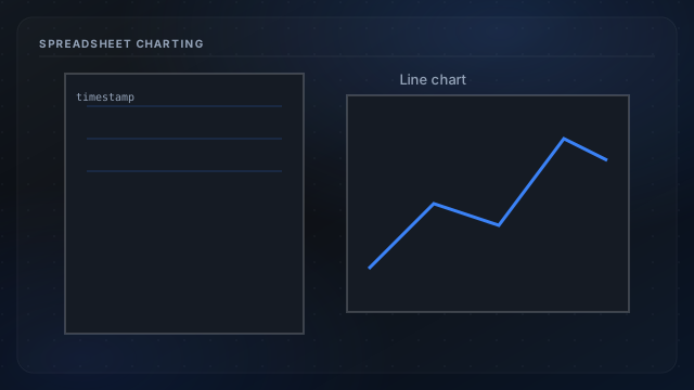
Import hygiene
- Parse timestamps as datetime, not text—sort ascending before charting.
- Split probe_key into separate series rather than one blended line.
- Keep Fahrenheit and Celsius columns consistent; pick one axis unit.
Useful chart types
- Rolling 24h minimum temp per zone for freeze planning.
- Dual-axis temp and humidity to spot condensation risk windows.
- Week-over-week overlays after insulation upgrades.
Correlate external data
Merge weather API CSV on aligned timestamps—see weather API parallel path. Mark manual events (door open, car parked) in a helper column to explain spikes from door swings or vehicle heat.